Here are the fonts I'm currently working on. Some of them are very incomplete or rough, especially in spacing and fit. In most cases, I've posted a PDF file so you can zoom in and see the letters up close, and also a FontForge SFD file so you can play with the outlines yourself. I'm always open to criticism and encouragement, so drop me a note (firstname.lastname@gmail.com is most likely to be read).
See also the OFL fonts page, which has some duplication with this one.
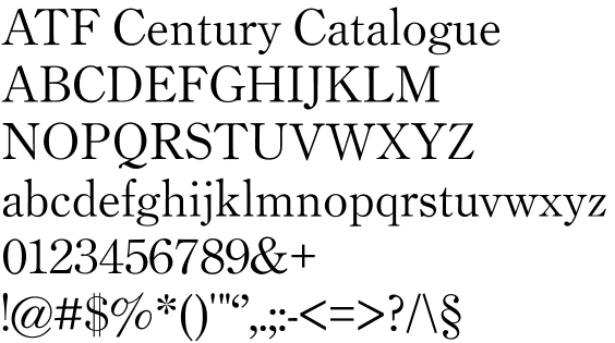
Century Catalogue

This font is currently the closest to release, with a decent glyph complement. It's a straightforward revival of a somewhat forgotten, but handsome and utilitarian, font from the ATF collection. It's obviously very similar to the familiar Century Oldstyle, but with more refined proportions and stroke. This version is based on the 18pt from the 1923 catalog.
The current version is released under the new Open Font License of SIL.
[ FontForge source | PostScript font file | PDF showing ]
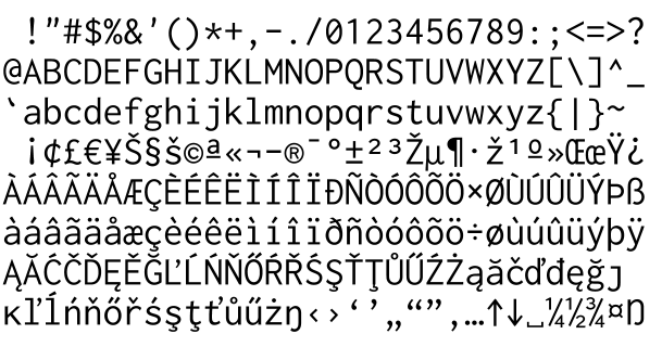
Inconsolata


This monospaced font design has its own page.
Museum Caps

I've fallen in love with the Centaur of Bruce Rogers. There is a respectable digital version by Monotype, but, as some have noted, it suffers from overly crisp rendering on modern devices. I think there's a lot of potential to implement optical scaling, and perhaps revive the Bible Centaur version as well.
It may well be years until I release this font, as I want to do it justice. I also want to make sure to strictly follow ethical guidelines for the release, as a version of the font is being sold by more or less the same company that first released it.
LeBe


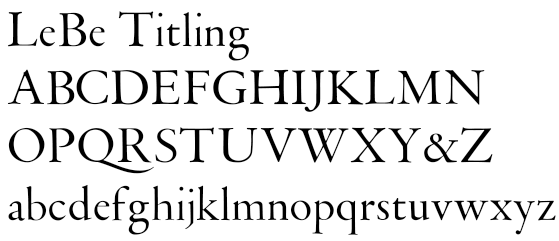
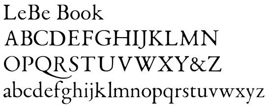
One of the most revelatory plates in Harry Carter's View of Early Typography is a specimen by one Guillaume LeBe. I have done a very literal tracing of both titling and book sizes of the letters, which might be the basis for a good font. I'm not really happy with the book size, as it faithfully reproduces the serious degradation I'm sure the specimen sheet endured in its (reduced size) reproduction.
LeBe Titling: [ FontForge source | PDF showing ]
LeBe Book: [ FontForge source | PDF showing ]
ATF Bodoni

The ATF Bodonis are quite beautiful, and technical tour de force as well. As part of an effort to understand the optical scaling done by Morris Benton Fuller, I traced a number of the Bodoni Book 12pt lowercase letters. I now realize that, both for better quality and to be more faithful to the scaling technology developed by Morris Benton and his father Linn Boyd Benton, I should consider the 18pt size of Bodoni Book to be the authoritative master. I have a feeling I'll come back to this one.
[ FontForge source | PDF showing ]
ATF Franklin Gothic

Similarly, while Franklin Gothic remains an extremely popular typeface to this day, I find a strength and beauty in the very original version produced by Morris Benton Fuller. Here I've traced the 14pt lowercase letters from the ATF 1941 specimen book. This version captures some of the unevenness and round edges common to letterpress printing of the day. I've since discovered that the 1912 book has much better printing quality.
[ FontForge source | PDF showing ]